Monday, April 10, 2017

CRITICAL CREATIVE REFLECTION

Here is my CCR, which is the process I took when creating this magazine! Hope you enjoy!

click HERE to view

-Sami <3

Sunday, April 9, 2017

I'M ACTUALLY FINISHED

Hey everyone!

Thank you so much for coming on this journey with me while I created this magazine. This is the final product. So much hard work went into this project and I'm so excited to show you the end product:


I'm so thankful I got to be a part of this project because this is going to help me so much in the future for exactly what I want to do!


Until next time,
-Sami <3

Thursday, April 6, 2017

BETTER LATE THAN NEVER

April 6, 2017
I have a complete change in plans for my double page spread. The fact that I was so focused on my idea for the multiple things regarding beauty, hair, skin, and makeup got way too out of hand and nothing really blended together. I was thinking about what I should write about in the copy on the page, and I couldn't think of anything that would tie the makeup, skin, and hair together. Instead of taking that route, I researched more inspiration on google images this time. Here is my new inspiration:

So, after I came up with this idea, I decided to run with it and start right away since I’m very behind. I went to my friends house after school. She has tons of skin care products, so I laid them out on her white desk that is right next to the window. Fortunately, she was there to help me because arranging the products was really difficult since I wanted to make sure that there was enough room around each product to write the price, name, and place to buy it. I also needed to have enough space for the article in the middle. 
The lighting was hard to master, but we ended up getting it under control after we made a makeshift reflector. My friend had this super shiny, thick paper that she held up by the window and it really worked. The sun wasn't as strong and it created a shadow for each product. It was a miracle. We ended up taking like 30. Here are a few:


I also wanted to have a picture of my friend with super clean and fresh look for the entire first page of the double page spread. This is similar to my inspiration, but I’m making it my own by having her fill the page. Since the aesthetic of my magazine is very white and crisp, this photo really fit the qualifications. Here are a few that we took.

I edited my favorite one on PicMonkey by brightening it and adding the shadow element. It turned out pretty good if I do say so myself. 
I’m probably going to add shadows through photoshop on each product to give the page more depth. I’ll include a photo of that later. 
Thanks for coming on this journey with me and seeing everything that I have accomplished. I’m so glad that I was given this amazing opportunity through this class. I loved this project so, so much!!

-Sami <3


Some Citations:
"PicMonkey's Photo Editor | Free Online Image Editing." PicMonkey. N.p., 15 June 2016. Web. 06 Apr. 2017.

Tuesday, April 4, 2017

PHOTO SHOOT PART 2

March 6, 2017

The cover is officially COMPLETE!! I ended up taking photos of my friend Ashley who is exactly what I was looking for: beachy vibes, blond-ish hair, and in my eyes, really pretty. I went over to her house yesterday and took lots of photos of her. I wasn't able to go over at the “golden hour,” so we had to make do with what we had. Luckily, I still was able to borrow the yearbook camera (Canon 70D) which has the best settings and amazing lighting features. I researched which setting the camera should be on to achieve the best quality with the brightest and whitest photos. I found out by reading the article and trial and error that the setting “M” is most helpful and ends up looking the prettiest. I started by using the “TV” setting, which I heard would highly brighten a photo, however, it was way too bright and I could barely see my subject. 
During the photoshoot, so many obstacles happened that hindered my abilities to take great pictures. One thing was the crazy sun shining on half of her face during the majority of the photos and the tree branches casting shadows everywhere. After 20 minutes of somehow being control of the sun, the pictures were pretty good. 
After about an hour of photo taking with so many different poses, I uploaded them onto my computer and imported my top 10 onto PicMonkey. This website is perfect for editing photos, especially close ups. I did basic editing. I increased the brightness, and highly increased the sharpness so I would be able to see her freckles, adding that natural element in. Here are a few photos I took and how they looked before being edited.

I ended up choosing this one for the cover and really edited it on PicMonkey. Here is the edited version. 

Adjusting it to the cover was pretty difficult. When I asked my peers for input on how they like it, they said they were getting a forest-y vibe, which was definitely not my intention. I took it upon myself to photoshop the green leaves out and replace it with the sky to hopefully gain that beach-y vibe. I think I achieved it. Here’s what it looks like.


-Sami <3

Some Citations:
"PicMonkey's Photo Editor | Free Online Image Editing." PicMonkey. N.p., 15 June 2016. Web. 04 Apr. 2017.
"How to Remove Unwanted Items from a Photo in Photoshop." PictureCorrect. N.p., 14 Oct. 2011. Web. 04 Apr. 2017

Monday, April 3, 2017

PHOTO SHOOT SUCCESS

April 3, 2017

      Finally I did the photo shoot!! This is what went down: I was so fortunate to have been able to borrow a Canon 70D camera from my yearbook class. This way the quality of my photos would be extremely clear and high definition. I'm also able to adjust the lighting on the camera settings so I was able to brighten the photo even before it was done. 
       I took a lot of photos of Cayla and the makeup since I wasn't sure which type I would end up liking. Unfortunately, Carly wasn't able to make it. I'm no longer relying on her, and I switched my model to someone named Ashley. I really want the photo of the girl on my cover to look slightly older and possibly in the 19-21 age range since after all, that is the range of ages my audience encompass. So, Ashley will be able to take photos next week on Monday; which if perfect because by then, my goal of finishing my double page spread should be done. 
      First of all, the photo shoot was so much fun and I cannot wait to take Ashley's pictures. So, I made sure that I brought props to Cayla's house such as a fur rug, to use as a texture underneath an overhead shot of makeup, my marble laptop cover, just in case I wanted to have another option for texture, and a towel so she can lay on for photo poses. I ended up using the fur rug and not the marble case since the was slightly small, so the makeup didn't fit right. 
      The lighting was slightly difficult to master, but I figured it out! It was an hour before sundown, the golden hour, when I went outside to take the photos; the lighting was perfect. 
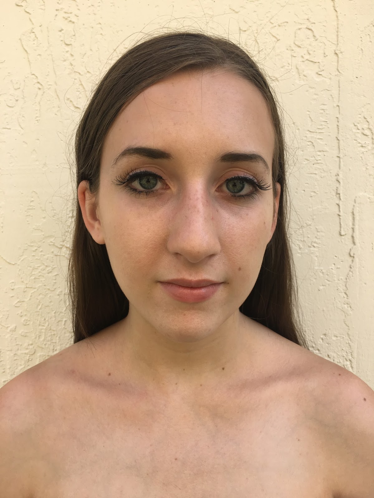
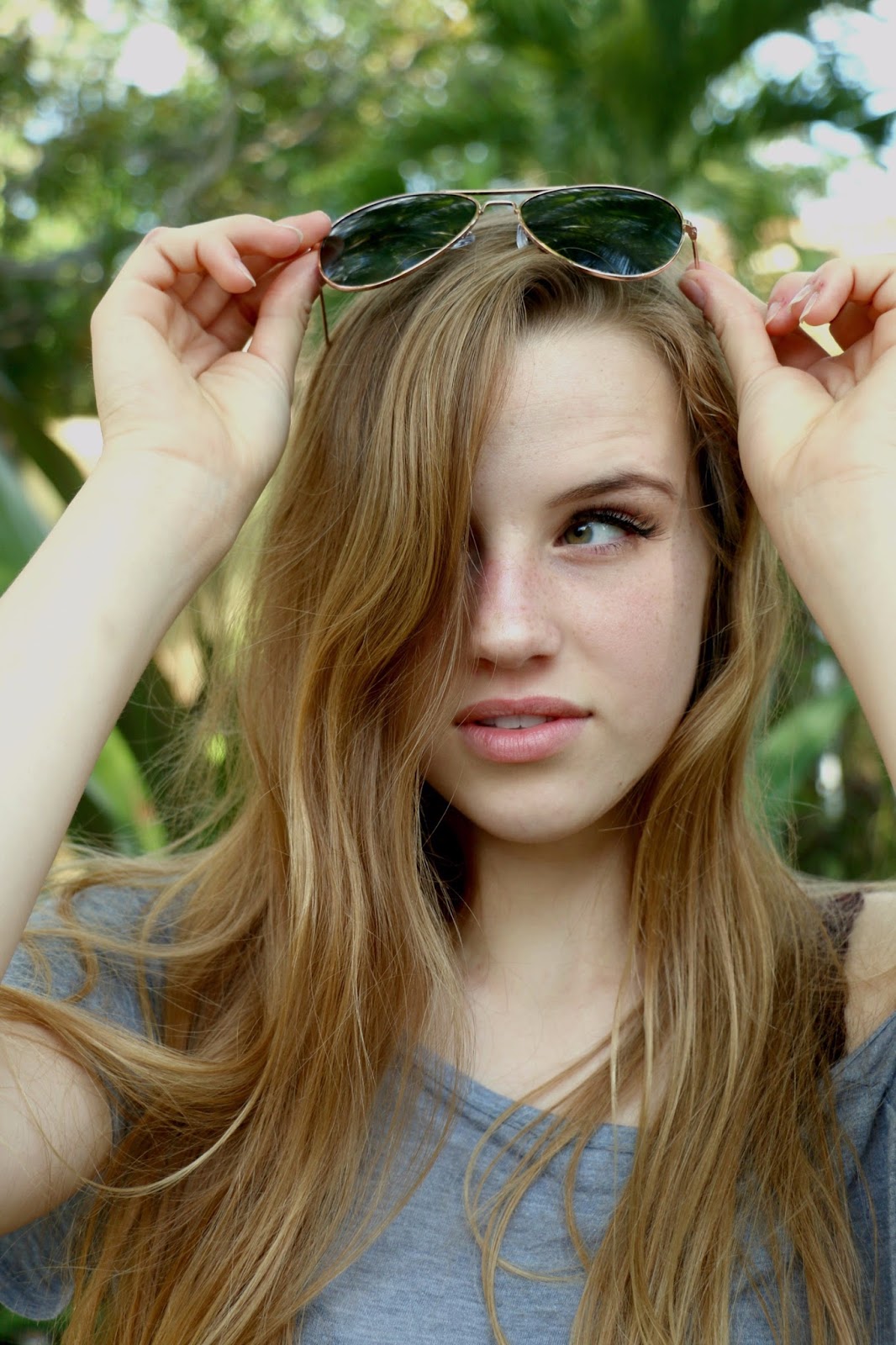
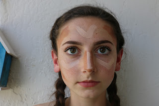
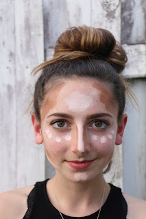
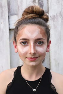
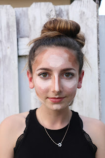
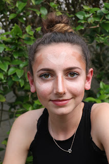
Doing Cayla's makeup specifically for photos that will be featured in the table of contents was pretty difficult. Mastering the highlight/conjuring look is very hard when you are just doing it for the picture. I learned that you have to exaggerate the makeup by putting a lot more than needed on her face to even see it on the camera. That took us about 30 minutes to figure it out and perfect the look. Part of the 30 minutes was spent trying to figure out the location of the photo. I knew it would be a close up of her face, but I didn't know what white background was available that had the best lighting. After trying several areas, we figured out that the white fence was the best option. It even looked summer-y which is the theme of the July issue. These are the pictures from before figuring out the lighting and amount of makeup vs. the after! Huge difference lol.


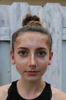
      For the second set of pictures, I laid out the make up on the fur rug in no specific order. I just left enough room around each product to be able to write the name of it and details about it on the spread. That wasn't as hard. I had mastered the lighting by then. Only thing is, I had to stand on a step stool to get a birds eye view of the makeup. Here are some of those photos:


      I decided to do a last minute photo shoot with Cayla sitting around the pool and laying on the floor just in case the Ashley or Carly wouldn't be able to do it and I have no other time to take more photos. I had Cayla pose pretty candid by the pool, with a towel wrapped around her, and her feet in the pool. I took that photo so many different times, and didn't end up liking any. I moved onto another pose: her laying on the towel looking up. This is cute in theory but it didn't turn out exactly what I was expecting. Worst comes to worst, I’ll use that, but hopefully I won’t need to. Here are some of those photos:

      I’m still taking more photos this weekend since I’m borrowing the camera, so my plans are to go to Target and HomeGoods and use different items from the stores to take certain photos for my table of contents. I don’t want to buy everything I use in my shoot, so why not just set it up at the store and take a quick pic? Hopefully I don’t get kicked out. Stay tuned!

Some Citations:
"Magical Light - How To Shoot During Golden Hour." Photography Concentrate. N.p., 07 Dec. 2015. Web. 31 Mar. 2017.


-Sami <3

Friday, March 31, 2017

COVER IS DONEEEEE

March 31, 2017

     Welcome back! Guess what? The cover is officially complete and looking amazing (even though I’m a little bias). Here’s a photo:

     So, here are a few things I focused on while making this cover just to make sure that I adjust everything to please my audience. 
     Fonts: I decide to go with very contrasting fonts. Since that is currently a trend with some fashion/lifestyle magazines, I decided to implement that element into my cover. I used five different fonts that all complement each other when placed together since they are bold, italicized, thin, cursive, and just plain normal. I choose to bold certain words that my audience would see standout and want to read more about such as “skin, bod, spill, flawless, etc.” The bolding was done is two different ways. The first was with the font “Gobold” and the just a bold, thick, straight slim font.           Since I need to change up the look since this cover cannot be plain, I also used “Gobold Italic” to complement the original, but bring up the looking make it classy. 
     Also, just like the table of contents, every single word has a drop shadow on it to stand out since it is in a while color against a white and bright photo that will be filled in soon. 
     My masthead is in the font “Fine Style” to keep it classy and sleek. I didn't want to include any other writing on the cover in that font since this magazine will be known for this font and appearance.
I changed up the font for the deadline to give it some contrast with a cursive look.  
My selling line is pretty original and really sums up the entire concept and meaning on my magazine.      Since I want all woman who read this to know how beautiful they are inside and out and the power they have, I choose the phrase “Love the woman you are. Exceed expectations.” 
      All of my cover lines include articles and sections from each of my parts of my magazine that my reader would enjoy reading since it relates to all different things that the readers would be into. 
      As far as my main cover line, I went with words that would inspire my readers and catch the attention of them. I specifically used the word “paradise” since the majority of people have their own paradise and would want to read about living in the paradise they have always want to have. 
     I also created a barcode using a website that was free and super easy. I choose numbers that are meaningful to me since it doesn't have to be a real barcode. 

Make sure to read all the cover lines and descriptions! Hopefully you enjoy it.

-Sami <3

Some Citations:

"Free Online Barcode Generator: Create Barcodes for Free!" Barcode Software RSS. N.p., n.d. Web. 31 Mar. 2017.

Wednesday, March 29, 2017

SO MUCH PROGRESS

March 29, 2017

The amount of progress that I have gotten done is insane. I finished my table of contents and my cover! The only thing I have to do for them is add in the correct photos, which is so exciting because this means I’m on track to finishing on time. Here’s some photos of what I have so far:


Referring to the table of contents, I ended up sticking to the boxy layout, still keeping it sleek looking since my original idea totally failed and looked pretty bad in hindsight. I kept playing with the layout until I figured out exactly how I wanted it: I needed one picture to be in between both pages or at least connect from one page to the next to allow for a connective look of the pages, which would bring the readers eyes from the left page to the right page smoothly. Th last thing I wanted was for the pages to look too separated and not cohesive. I also hate reading fashion/lifestyle magazines that don’t seem attached or relate to each other. Also, I decided to not have a list of article names that will be featured in each section. That took up way too much room and looked way over crowded since my main focus was on the photos and small titles. I did include a small phrase relating to the topic in that section.

Fonts are the best part!!

I am in love with the cursive in contrast to the Times New Roman look. It is truly a mix of classy and sleek, and that combination is really the key for my magazine since that is exactly what my audience is into. I also used a splash of color in the title just to represent the summer vibe with color. However, all my photos are very white and bright to avoid the overcrowded look. There are quite a few photos and I don’t want my readers to feel overwhelmed. 

These are font’s I chose:
Fine Style
Shorelines Script Bold
PT Serif
Champagne and Limous


On top of each photo, I have the page that it is one written as “page 2.” I actually added a drop shadow to each one to allow it to stand out against the white-ish and bright color the photo would be admitting. Also, since each “page 2” is in white, that shadow was crucial for reading it. 

I’m going to do an in-depth “cover” blogpost next since that is going to involve a lot of explaining.

Oh, and the photo shoot actually happened a few hours ago… that means another blogpost coming soon with the details of the fun and productive experience.

-Sami <3

Some Citations:
"New & Fresh Fonts." 1001 Fonts · Free Fonts Baby! N.p., n.d. Web. 27 Mar. 2017.

Pinterest. N.p., n.d. Web. 27 Mar. 2017.